1. Choosing the Best Fonts for Tattoos
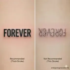
Unlike digital designs, tattoos are susceptible to ink "bleeding" and aging. The most critical factor for a lasting Ambigram tattoo is the font style. We recommend designs that minimize fine lines and maximize stroke thickness to ensure legibility for decades.
Clarity and Thicker Strokes
Avoid ultra-thin fonts. Thick, consistent lines reduce the risk of ink diffusion (blowout) over time, which can quickly turn a design into an illegible blur.
Calligraphy vs. Block
For long words or two-name ambigrams, a stylized block font is often safer and easier for the tattoo artist to execute with precision.
2. Preparation & Placement
A Two-Name Ambigram tattoo is deeply personal. The process requires extra care to ensure both words read clearly and the design ages gracefully. Follow this checklist for best results.
-
Sizing is Key: Your ambigram must be large enough. If it's too small, the subtle connections between letters will merge over time.
-
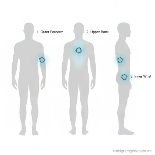
Ideal Placement: Flat, large areas are best for rotational designs. Recommended spots include the outer forearm, upper back, and inner wrist.
-
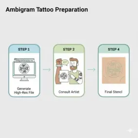
Consult Your Artist: Always bring the high-resolution file from our ambigram generator to your tattoo artist to create a perfect stencil.
-
Test the Design: Before committing, print the design and tape it onto your skin to verify both words read correctly from your perspective.